Posts

Showing posts from November, 2024

Type 2, Assignment 3, Post 1- Tricky, tricky
Image
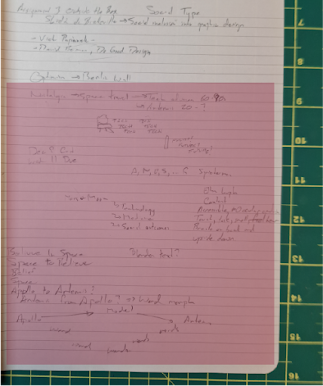
 This took a long time to figure out. 18/11 My first idea was to do something about optimism. I thought about the how Berlin held out during the blockade and how the 50s and 60s had unlimited optimism about the space program. I considered how space research leads to a huge amount of Earth based benefits. Material sciences, climate research, etc. This seemed a bit blah, but the initial plan where I would incorporate video came from this. (red box) The next idea was to do something about my medical problems and how it has affected my personality. Nope. (blue box)   So I was sort of stuck. 4 hours 20/11 Finally I was going through an junk drawer and found a post card from my dad. This evolved into documenting a series of letters between my parents in the late 80s. My dad's correspondence is typed, my mother's written. I think this will be a nice contrast in typography. I've also scanned some photos to give the viewer some more insight into my parents. I started working on the ...

AAD Assignment 3, Post 1- Initial ideas and concepts

Image
18 November So, a logo, more than that a branding package and identity.  My first reaction was, oh another logo.  This would be the fourth design a logo for yourself assignment during the program.  Not very exciting. Fairly quickly I decided that I wanted to do something based on my maternal grandparent's heritage. Not sure why, but once it crossed my mind I couldn't get rid of it.  The mood board incorporated items from Royal Mail, my grandfather worked for them from before the First World War to after the Second.  It also laid out some of the values I wanted to incorporate. Early on I went through a few ideas for the logo.  The use of Norn (Orcadian norse) and runes was considered.  Incorporating the sheep from North Ronaldsay that eat seaweed seemed like a good idea. As you can see from the image below I went through four names before I settled on Dulse Sheep Designs. Ignore the red stuff, unless you want to learn the name of the F1 typeface. Under ...

AAD Assignment 2- Post 4, Oooops

 So I forgot completely about the cost and time information. Better late than never I guess. Good thing we talked about the price of printing today, right? Costs: Materials: $0.30, I already had the vinyl backing for free. Three sheets of my own, previously purchased, cardstock tabloid. Bond tabloid is included in printing costs. Printing costs: Twice as much as needed. 9 colour copies ($1 per), 5 BW prints ($0.20 per) Total: $10.30 Time: Concept development: 3 hours Ideation: 4 hours Product development and research: 3 hours Drawing and final work: 10 hours Production (digital arranging, printing, physical assembly): 5 hours Blogging: 2 hours

AAD Assignment 2- Post 3, Illustration and product development

Image
 So I can't really draw. I made a digital sketches in Procreate and two pencil sketches (only 1 pencil sketch attached). The concept was to show two people using caution around hazards and then reporting it, warn people from doing hazardous activities, and a hand and foot. The hand was not used. The foot is designed to be used to demonstrate a hazardous activity.  For backgrounds I had two photos that I took years ago. While both were in North Africa, the colouring in these could be altered to show different environments as there is both ground and vegetation present. So I struggled with the sketches, finally I decided to try the Generate Vectors function in Illustrator 2025. This produced very happy people with no legs, but it was a something I could work with. I changed the faces to be more serious, and added legs. I applied the Generate Vectors to my foot and it produced a nice bright beach sandal that just needed a colour adjustment. With these assets in hand I set about a...

Type 2, Assignment 2- Post 3, Applied Fever

Image
 I have noted a practical application of White Line Fever in the wild. Very exciting!! It cautions smokers to watch both ways before merging into the main path between the Cultural Centre and MHC's main building. This is good as it will get them moving their head and freeing up the tar deposited in their lungs. The fact there's a ? at the end might also encourage the smoke to look at the habit from both sides, quit or not quit. White Line Fever, good for safety, good for your lungs! 

AAD Assignment 2- Post 2, Deliverable development

Image
 Once I decided on who to work with I developed the mood board and thought about deliverables for the proposal. The normal safety leaflets were an obvious choice as I had immediately found some problems (see previous post). I also thought about the conflict between some humanitarian ration packs and some cluster munitions. This is sort of poor communication I want to avoid, so I decided to work on overpack for the rations. I also had an idea that the overpack could be used as a bag by including handles. I produced an overpack but I did not incorporate the handles due to the lack of a good glue for attaching vinyl backing to vinyl backing. Turns out that material designed to release an adhesive does stick well (note that the overpack is fragile). I think some sort of heat sealing would be the solution.  While producing the overpack I used a standard ration to size it. It is oversized and a ration bag fits in nicely. The bellows bottom is not needed, it would help with its funct...

Type 2, Assignment 2- Post 2, Linery of White Line Fever

Image
 So now the rules for the lines were decided I needed to draw them. I went through a few iterations. As I was inspired by the New Alphabet I kept my marked up guide next to me. I started on three handraulic versions. The first one was during my ideation, see previous post for those doodles. It was more to decide if I wanted solid, outline, negative space, etc. Didn't go far. Then my first alphabet, in my notebook. I was still working out line weight and if there were curves (there weren't in the end). This is also where I decided on the name, White Line Fever. The madness that comes over you after driving too much. The second one is closer to what was done. No curves, but still working on line weights. My final version was done in Fontlab. Of course I let my 10 day license lapse before I took a screen shot, but here is my type specimen. Lessons learned: Taking on new software is challenging. Taking on new software that has a relatively small market is harder as tutorials are sc...