Type 2, Assignment 2- Post 2, Linery of White Line Fever
So now the rules for the lines were decided I needed to draw them. I went through a few iterations. As I was inspired by the New Alphabet I kept my marked up guide next to me.
I started on three handraulic versions. The first one was during my ideation, see previous post for those doodles. It was more to decide if I wanted solid, outline, negative space, etc. Didn't go far.
Then my first alphabet, in my notebook. I was still working out line weight and if there were curves (there weren't in the end). This is also where I decided on the name, White Line Fever. The madness that comes over you after driving too much.
The second one is closer to what was done. No curves, but still working on line weights.
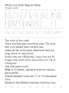
My final version was done in Fontlab. Of course I let my 10 day license lapse before I took a screen shot, but here is my type specimen.
Lessons learned: Taking on new software is challenging. Taking on new software that has a relatively small market is harder as tutorials are scarce and sometimes poorly made.
Enough of criticizing my tools. On to why I made White Line Fever the way I did.
Monospace: Lanes in a specific type of road (highway, residential) are all the same width.
Tails and bowls: I deviated from lane markings to make the Q's tail and the angles on O, U, etc, based on pedestrian crosswalks. Aesthetically I found it the best solution.
Angles: Angles are troublesome as they make the line width vary, especially if you want angled terminals. I compromised and made the width of angled lines as close to 6 or 12 that also looked good.
Ascenders and descenders and bowls below the baseline/above the cap height: I wanted none at first, to keep with the monospace idea, but vertically. I discovered it didn't look good. I have seen mis-painted lines don't perfectly align on the road, so figured I could do the same if it made it prettier.
This was a good project. It expanded my understanding of not only what a typeface has to communicate, but also what has to go into it to achieve it's purpose.
White Line Fever's purpose is to mirror the roads in Medicine Hat, and I think it does that by slowing legibility, just like traveling is slowed by the roads.
But you'll get there in the end, and it will not take as long as you expected.


Comments